Blog:The Scrivener's Diary
The Scrivener's Diary is a blog by Huw Williams (User:Huwmanbeing). Registered users may post comments to the talk page.
A Year of Maps
13 June 2021
Yikes, I just realized it's been nearly a year since my last post here, and a strange and turbulent year it's certainly been. I'm thankful to be able to say that all is well here, and I hope that you too, dear reader, have been able to make it safely through the pandemic, get your jabs, and maybe even start enjoying a gradual return to normalcy.
Mapping adventures is still my favorite Eamon-related pastime and in recent months I've been able to finish quite a few, so I think for this first blog post of 2021 I'll just give a quick summary of some of the latest cartographical additions I've made to the wiki:
The Vile Grimoire of Jaldi'al by Michael Penner
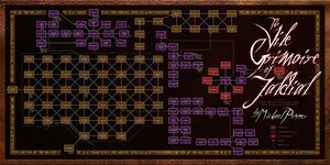
This adventure was an absolute treat to map! Mike Penner's story is excellent and his descriptions are wonderfully evocative, conjuring the sights and sounds of grey, misty days and inky-black nights spent wandering a vast and haunted graveyard. I had the pleasure of being able to correspond with Mike while making the map to get his input on how best to show everything (as well as to make sure the accompanying walkthrough was accurate), and I hope the result is both useful and appealing. The symbols around the border are words from one of the poems that Mike wrote for the adventure, converted to runes.
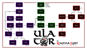
If the title Ula Tor isn't familiar to you, don't be surprised — it's not an Eamon adventure, but instead is an obscure, one-off, standalone interactive story created by Norwegian author and developer Ragnar Fyri, started on the Apple II and later completed for the Amiga. (Fyri's name might ring a bell since he authored a revised Eamon master in the mid-1980s.)
I stumbled across Ula Tor by accident while browsing some old text adventure collections and, recognizing the author, I decided to give it a try. The story is short and simple — you must rescue a kidnapped princeling from the mountain lair of a dragon — but it has some fun little puzzles and special features, and I enjoyed playing through it. I tried to share a copy of my finished map with Fyri by email, but sadly learned that he had passed away in 2011. Fyri's homepage remains online, though, and shows that he was an avid gamer active in a variety of MUCKS and MUDs, and was even toying with building his own textual/graphical adventure game. He seemed like a fun, imaginative man and I'm sorry I'll never get to correspond with him, but I'm glad to have learned a little about his life and am happy to dedicate this map to his memory.
The King's Testing Ground by Donald Brown
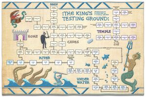
This is my first SwordThrust map: it shows the system's equivalent of the Eamon Beginners Cave, a simple set of caverns and passages built for the purpose of giving novice guild members some relatively easy loot and experience.
I had the idea of mapping all seven of the SwordThrust adventures in the style of the famous 11th-century Bayeux Tapestry, and experimented with ways of simulating the look and feel of embroidered cloth. Though the results on this first map aren't perfect, it was a fun project that pushed me to learn the ins-and-outs of some corners of Photoshop that I wasn't very familiar with, and I hope sometime soon to push on and get maps of the other six faux-embroidered as well.
By the way, the merman wielding a trident is patterned after the cover artwork for the series. I'd love to find the name of the talented artist who did the painting for CE but so far I have no leads; if you have any insights, please just let me know!
The Curse of the Hellsblade by John Nelson
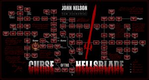
Somehow I'd never gotten around to playing John Nelson's Curse of the Hellsblade before this year, but when I realized that I hadn't yet mapped any of Nelson's adventures — a terrible oversight since he's the most prolific author in the Eamon corpus — I picked Hellsblade as my starting point, and it turned out to be an excellent choice. I thought the idea of being stuck with a weapon that was too powerful and that I had to work to contain was really creative, and Nelson's choice to reveal the blade's backstory through scattered diaries and bits of parchment was a lovely touch that added depth and human interest to the story.
I enjoyed working on the typography for this map, and in particular doing the steel and gore of the title text.
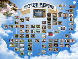
"And now for something completely different..."
As someone who grew up memorizing and quoting Monty Python sketches with my friends, I knew that I needed to map Rick Krebs's Flying Circus, and that I needed to pull out all the stops. I started off by laying out the rooms in Trizbort, then brought the map into Photoshop and went room by room, replacing each box with a matching screenshot from the corresponding TV sketch or movie scene. Finding and grabbing just the right shot for each one was a time-consuming task, but it was also a wonderful opportunity to re-watch a lot of the classic sketches, some of which I hadn't seen for years.
The best part of the project was that it gave me a great conversation starter with Rick himself, an accomplished professional game designer who worked on Dungeons & Dragons and various other RPGs. He was happy to get my message, fondly remembered writing Flying Circus and Blood Feud, and was gracious enough to answer all my questions. (You can read Rick's comments here.)
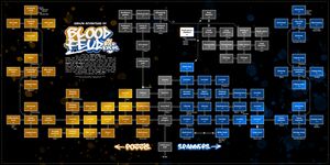
Blood Feud was the easier of Krebs's two adventures to map, in part because of the regular and mostly symmetrical layout of the castle where the feud between the rival Pozzis and Spanners plays out. My 10-year-old daughter enjoyed watching me work on this map and asked about what kinds of things were in the adventure; I told her the backstory and the mission, and described the story's main villain, Suedo Guru. She was amused to learn that the goal of the adventure was to retrieve the "Rod of Stupidity" and was inspired to draw a picture (here) of the smirking Guru wielding the mystical rod. I love that she's now a bona fide wiki contributor and I hope to commission her to create a few more pieces of Eamon-related artwork. :)
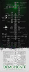
A few weeks ago my wife and I started watching the Netflix series Shadow and Bone, a beautifully realized adaptation of a book series about a fantasy land that's been split in two by "the Fold" — a massive wall of dark, magical clouds, nearly impassable and teeming with dangerous creatures. The moment I saw the Fold I was instantly reminded of the Shadow Wall that Purvis created over 20 years earlier for Demongate, its vast, swirling form looming over the countryside and repelling all but the bravest explorers. I made the wall the focus of the map, bisecting it into light and dark halves, with the dark portion faintly illuminated by the unnatural green light of the portal. It was a fun map to build, refreshingly different in shape and tone from most of the others.
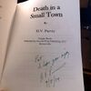
While doing some research for the adventure article, I learned that Hoyle Purvis moved on from writing Eamon adventures to writing actual novels, most of which are available at Amazon or through used book-sellers. I picked up a used copy of his 2014 novel Death in a Small Town and was pleased to find his hand-written inscription on the title page. I haven't read it yet but I have it in my queue and will post more about it when I'm finished.
The Temple of Dread by Frank Black
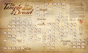
Just as with John Nelson, I knew it would be a crime to go very long without mapping at least one of Frank Black's adventures since his impact on the world of Eamon has been so profound, but I decided I'd work from the fringes in, and started with a lesser-known work that technically lies outside the Eamon series: The Temple of Dread, a standalone adventure published by Softdisk in 1993. Though generally keeping to the style of Brown's series, Black introduces some interesting features in Temple of Dread, notably including the ability to muscle your way through practically any locked door you encounter (and there are a lot of them). I always felt like that was something that a mighty, well-armed adventurer should be able to do in any adventure and I found crashing through them to be oddly satisfying. The little sketch of the sword and shield in the middle of the map is a callback to Black's original splash screen.
The Death Star by Donald Brown
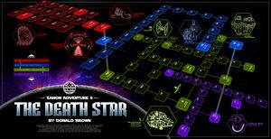
The Death Star is a physically sprawling adventure that consists of 90 rooms spread across four levels within the Empire's mighty space station. I first tried arranging flat maps of these four levels side-by-side, but that took a lot of room, left lots of empty space, and frankly didn't look great, so I tried an alternative: stacking the levels vertically and then viewing them from a station point partly to the side and above the map. This allowed for a more compact map where the levels partially overlap, and was made possible by Donald Brown himself who arranged his rooms in a logical way such that the points connected by the bounce tubes do indeed vertically align just as they should.
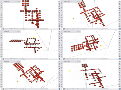
To build the perspective view I started in SketchUp, adding all the rooms and their horizontal and vertical connections into a three-dimensional volume, then orbiting around it to find a suitable viewing angle. Once I found the best view, I rendered it and brought it into Photoshop to do the coloring, lettering, and final effects. For the room names and numbers I arranged them all over flat maps of each level, rasterized them, manually applied distortion to match the perspective of each level, and laid them over the top of the SketchUp rendering. (The lettering is in a Latinized version of Aurebesh, the primary writing system used throughout the Star Wars galaxy.) For the callout images I used a mix of free 3D models and stylized shots from the movie.
* * *
That's it for now; I promise that I won't wait a year before making another blog post, and that for the next one I'll move on to something other than maps. Take care and stay well!
The Remapped Island of Apple
28 June 2020
Admittedly, Donald Brown's The Lost Island of Apple is not the most complete or polished Eamon adventure. The enemies are few and repetitive, the setting is sparse, and the plot thin and undeveloped.
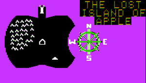
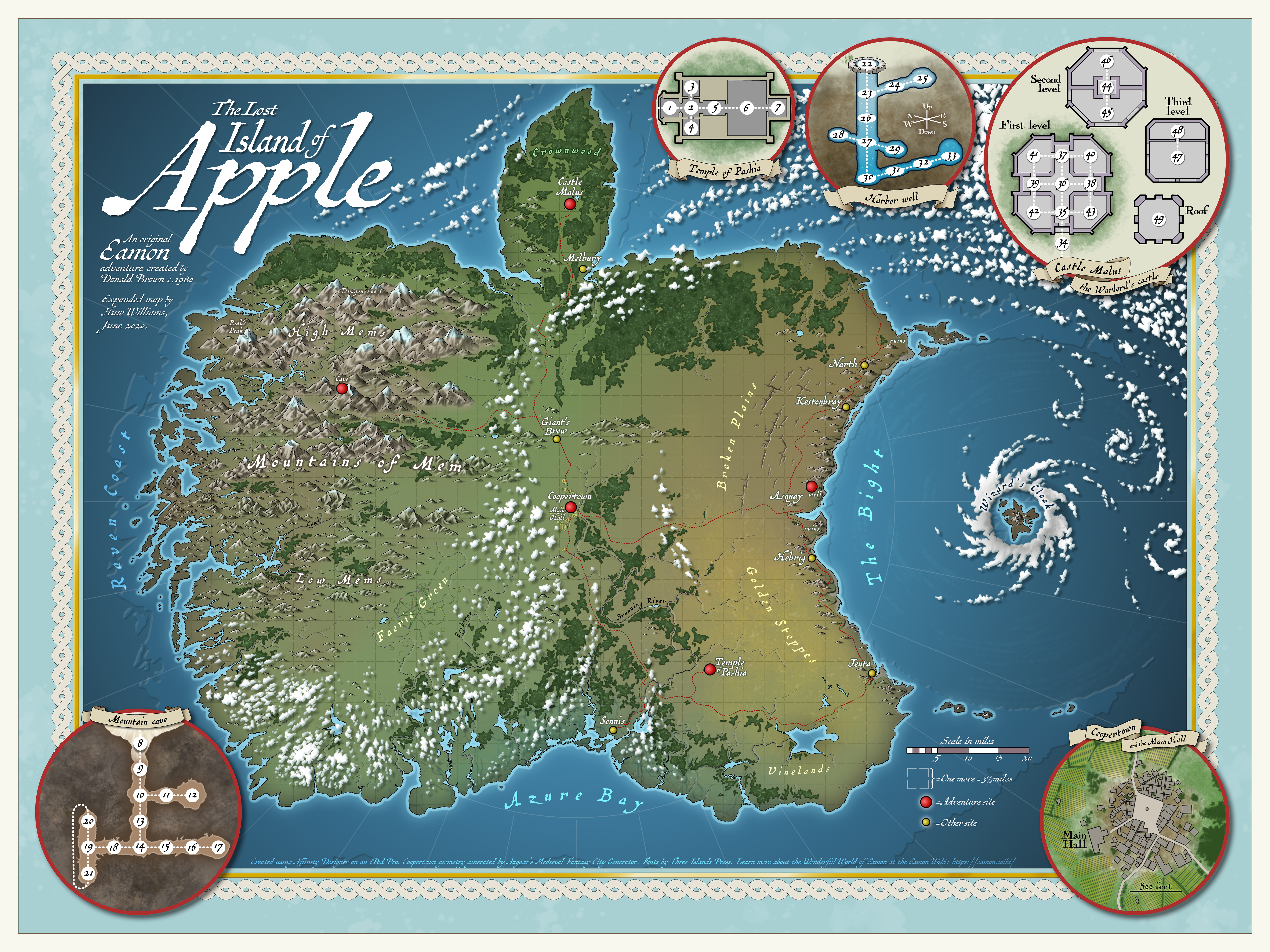
And yet... I've always had a special fondness for The Lost Island of Apple ever since I first played it as a child some 35 years ago because it featured something remarkable and entirely unique in the context of Eamon: the ability to walk freely across a graphical map! I was quite taken by it when I first played it on my brother's Apple II, and I remember imagining what it might be like if I could peek past the pixelated veil of the computer screen and behold all the hidden details of this strange, dark island floating in a magenta sea.
That thought returned to me again a few weeks ago as I was learning to use a new art application on my tablet and wondering what a good project might be for me to cut my teeth on. Apple Island! I could have some fun expanding on Brown's map and perhaps finally reveal a bit of the complexity that I imagined was hiding behind the blocky '80s pixels of the original. I took up my pencil and set to work.
For those who want the blow-by-blow of the project that ensued, or who enjoy ramblings on speculative cartography, please read on; others feel free to skip to the end to see the final product.
Scale

The first thing I needed to figure out was the approximate size of the island. Though Brown didn't put a scale bar on his map, he did leave a clue in the introduction when he noted that "every movement you take lasts a third of a day;" I therefore dispatched to the island the ever-dependable Sam (pride of the Guild, hero of Evenhold) and counted the number of moves it took him to traverse it. The result was 28 moves (or 9⅓ days) to cross east-to-west, and 27 moves (9 days) north-to-south.
To convert these travel times to distances, I began by checking a variety of fitness and hiking websites, most of which agreed that a healthy, experienced hiker, stopping for breaks and meals, walking good trails in decent weather, and using relatively lightweight equipment might reasonably walk 20 miles in a day. Applied directly to Sam's travel times, this pace might suggest that the island is close to 200 miles wide, but there are quite a few factors that almost certainly cut his daily mileage:
- While the 20-miles-a day-figure is the distance walked, it's not necessarily the straight "beeline" mileage from start point to end point. Unless Sam's path is perfectly straight, the beeline distance he covers will always be less than his walking distance.
- The island is depicted as a wild and dangerous place where one wouldn't expect to find abundant paths or well-maintained roads, so for much of the time Sam is probably hacking through trackless wilderness.
- A fair portion of the island is mountainous and necessarily slower to traverse.
- Sam is hauling a sizable amount of food, multiple weapons, armor, and treasure.
- He's often interrupted by the appearance of wild animals and sometimes-hostile strangers.
- He isn't just crossing the land at top speed but seemingly searching as he goes, looking for relatively small features like cave entrances and water holes.
- His pace must be one that's comfortable and sustainable over the weeks of travel necessary for him to reach all the key parts of the island.
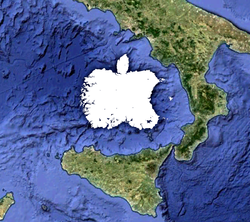
These factors introduce a considerable amount of variability and uncertainty, and no doubt cut the linear distance that even a fit individual like Sam might expect to cover in a day, possibly by quite a lot. Bearing all of this in mind, I settled on an average pace of about 10 miles a day, or 3⅓ miles per move — a respectable speed I think, given the rugged terrain and frequent distractions. Using this figure, I concluded that the island has a diameter of about 90 miles, and an area of perhaps 6,000 square miles, falling in size somewhere between the islands of Jamaica and Sardinia. Plenty of room for mountains, plains, castles, bears, dragons, and a bevy of panhandling hermits.
Geomorphology
Equipped with a sense of the island's scale, I next needed to work out the shape of the landscape. The only significant topographical feature Brown described was a set of mountains in the west/northwest, so I started with the basic idea of a sharply uplifted western range gradually subsiding into foothills and more open plains to the east and south. I fancied the western coast to be a lot like Norway's, jagged and pierced by innumerable fjords and rocky inlets, loomed over by sharp, snow-covered peaks. While drawing the coastline I was reminded of Slartibartfast from The Hitchhiker's Guide who rhapsodized about Norway's "lovely crinkley edges" and how fjords give a continent "a lovely baroque feel."
Another significant feature of Brown's island is the wide semi-circular bay to the east, which given its smoothly-arced boundary I interpreted as the edge of an ancient impact crater, and which I whimsically named The Bight. In keeping with the structure of most complex craters I added low hills around the rim and an island in the middle of the bay formed from the uplifted central peak (obscured in Brown's original by the compass rose). The plains outside the crater betray signs of fracturing, including narrow canyons and cenotes, and due to the crater's raised rim drain north or south to the sea.
The smaller southern bay I rimmed with wet lowlands, and the northern peninsula (a sharp rectangle in Brown's original) I softened into a more leaf-like shape, closer to that of the Apple logo which the island's coast is patterned after.

Biomes
When it came to laying out the island's biomes, I was on my own: neither the original map nor the in-game descriptions gave any clue to the kinds of environments I was making my long-suffering Sam hike through. Grassy, wind-swept steppes? Rank, steamy jungles? I wanted to ground my choices in something relevant, so I turned to the original Apple logo that had inspired Brown. Its rainbow stripes reminded me of the growing zone maps printed in the old Burpee Seed catalogs my mother used to browse, or the brightly colored bands of a Köppen climate map. Knowing that a 90-mile-wide island probably wouldn't have a terribly diverse range of climates, I applied the colors loosely, filling the northern portions of the island with forests to represent the logo's green top stripe, riddling the southern lowlands with lakes and streams after the logo's blue bottom stripe, and throwing in some golden steppes and ruddy canyon lands in the interior to represent the warm intervening colors.
Names and sites
With the setting established, it was time to bring a little life and flavor to the island by adding settlements, roads, buildings, labels, and other signs of civilization. Brown identified only five specific sites on his original map so I started with those:
- The "crude Main Hall" near the center of the map. Though not shown in the adventure, it seemed reasonable to assume the existence of a settlement near the hall, particularly given the seemingly endless supplies of food available for purchase there. I gave it the name of Coopertown (a reference to Cupertino, site of Apple's HQ), a title that suggests a former trade in casks and barrel-making, though the town is now mostly agricultural and surrounded by crop fields and livestock pastures.
- The Warlord's castle, which I named Castle Malus from the Latin word for apple.
- The Temple of Pashia, on the edge of the island's southeastern steppes
- The water hole near the bay
- The mountain cave
These few sites left many miles of empty, boring space on the map and seemed insufficient for even a sparsely populated island, so here I felt it necessary to create a number of my own embellishments out of whole cloth — or very nearly so. Experienced Eamonauts will know that Brown kept his tongue pretty firmly in his cheek with most of his adventures, never shy to slip in a quirky, anachronistic reference or drop a groan-inducing pun (remember the Wand'ring Minstrel Eye from The Lair of the Minotaur?), so in the interests of retaining at least a little of his humorous sensibility I threw in a few references that Apple aficionados might spot.
- The mountainous region I named the Mountains of Mem, with high northern and low southern ranges (HIMEM, LOMEM), drained in part by the River Cawl (CALL) and overlooked at the west by the island's highest point, Poak's Peak (POKE, PEEK). This latter I imagine was named for the intrepid Aldus Poak, a noted explorer and cartographer in the age of the Council of Twelve, and the first to chart the coast. Dragons are known to roost on the northern flanks of the High Mems.
- I lined the edge of the Bight with scattered fishing villages, the largest and most central being the harbor town of Asquay (ASCII), the name a corruption of the earlier "East Quay". The names of the surrounding villages of Narth, Kestonbray, and Jenta don't refer to anything; I just liked the way they sounded. I also marked a couple of centuries-old ruined towns standing in the hills along the edge of the Bight; their nature and origins are unstudied but some at the Main Hall in Coopertown suggest they may be the remains of long-deserted Ervuolian or Lanstian outposts.
- At the very center of the Bight I placed an unnamed islet, the nature of which is unknown even to the locals. It's shrouded by a perpetually swirling wall of clouds they call "the Wizard's Cloak" and protected by impassable ocean currents, powered for centuries by some unseen force within, for reasons yet unknown.
- The only settlement of any significance on the southern coast is Sennis, a waterlogged community on Azure Bay surrounded by the saltwater marshes at the mouth of the River Brunning.
- Other villages include Melbury, a castle town just south of the Warlord's fortress, and Giant's Brow, a village on the rocky ridge dividing the north and south plains.
- The wild western coast has no towns to speak of but is purported to be frequented by pirates (both human and goblin) who shelter in the shadowy channels. Though ravens can be found throughout the island, the name "Raven Coast" is probably a corruption of "riven", referring to the fractured coastline.
- Fairies inhabit the sunny grasslands of the southwest, where flowers and fungi grow in vast, arcane patterns to mark the magical intersections between Eamon and the realm of the fey.
Finishing touches
The five detailed insets were fun to make, though they took almost as long as the rest of the map. The water hole was a particular challenge since branches of the tunnel extend in every direction — difficult to show without resorting to stacked slices! For the detail of Coopertown I turned to the Medieval Fantasy City Generator by Watabou, a great utility that can quickly generate the geometry of a random village within some customized constraints.
Finally I surrounded the map with a twisted rope pattern, and within the tiny gap inside each twist hid the outline of Brown's original island.
Below is the final product:
If I ever have the inspiration, energy, and time to craft an Eamon adventure of my own, I could easily imagine setting it on the Island of Apple; I'd also be delighted to see others use the setting. The land includes lots of hooks for possible stories, plus plenty of open space for new and exciting features yet unguessed.
Map-wise, my intention is to take what I've learned from this project and apply it over the coming months to some original maps for other Eamon adventures (a new Zyphur River map is in the works), or possibly to new versions of the charts in Hurst's Gazetteer.
Like my imagined explorer Aldus Poak, I'm eager to chart the many wild, magical lands of Eamon!
Foreword
27 June 2020
Voilà — a new blog is born!
I thought it would be fun to post some thoughts and commentary now and then regarding my Eamon-related endeavors, so I'm diving right in. Mediawiki isn't the perfect blogging platform since it lacks many of the niceties that dedicated blog sites provide, but hey, it meets my simple needs, and it feels rather nice to keep it in with all the other wiki content, so for now, here it lives. I do plan to add some extensions, build a few templates, and make some display tweaks to improve the experience, and at some point may cross-post elsewhere.
I hope you enjoy it, and please drop me a message if you have any comments or suggestions. Thanks!
